

A clearer visual model for the Apparent Certainty Framework

When I first shared the Apparent Certainty Framework, I knew the visual model would continue to evolve.
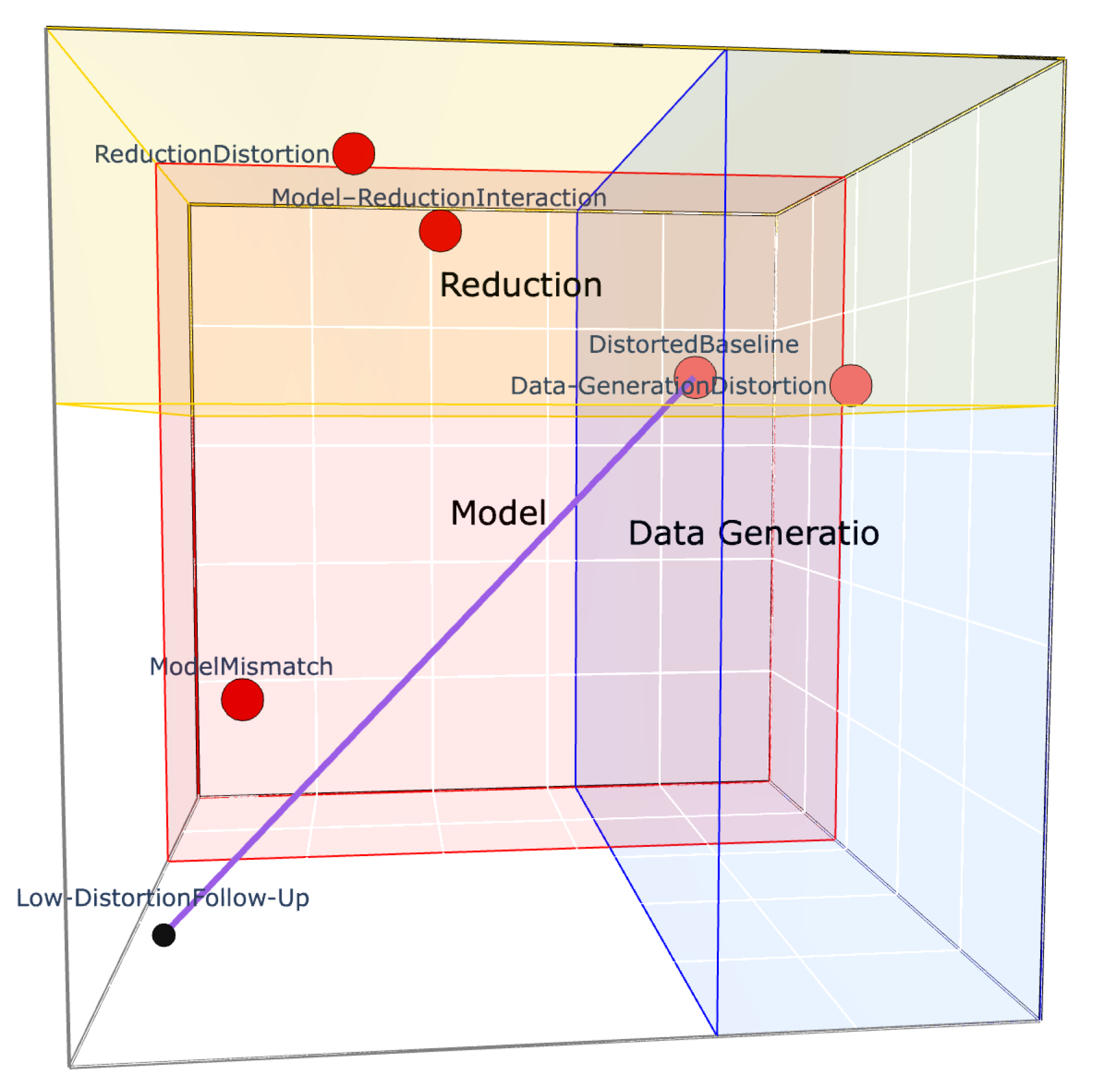
The framework itself has not changed. Its central idea is still this:
Results can look more certain than the processes that produce them justify.
But over the past several days, I’ve refined the interactive model so it communicates that idea more clearly.
The latest version is cleaner and more focused. I simplified some of the public-facing labeling, tightened the visual structure, and clarified the three distortion domains:
Data Generation: how the signal is generated and acquired
Model: how the signal is defined and interpreted
Reduction: how the result is selected, calculated, and reported
The pathway, system modifier, and central tension of the framework remain intact. The goal was not to make the model more elaborate, but to make it easier to read and easier to understand.
This is still an early framework, and I expect it to keep sharpening as I work through its implications. But this version feels much closer to the visual language I was trying to find from the beginning.